MOTO G 3rd GEN : Review
The war in the smartphones is going up day by day.Especially when it comes to the budget region , the consumer's want all the features in all in one device and also should offer a great price. The competition is increasing day by day and one of the key players in this segment is Motorola. With the initial release of Moto G , the phone made a huge success in the market. And again with the second release , the company had a the same reactions. Now with the 3rd Generation of Moto G , it looks like it's increasing the bar for every company day by day. Can this Motorola G keep the way the promises it's predecessors have kept till date ?
Hardware :
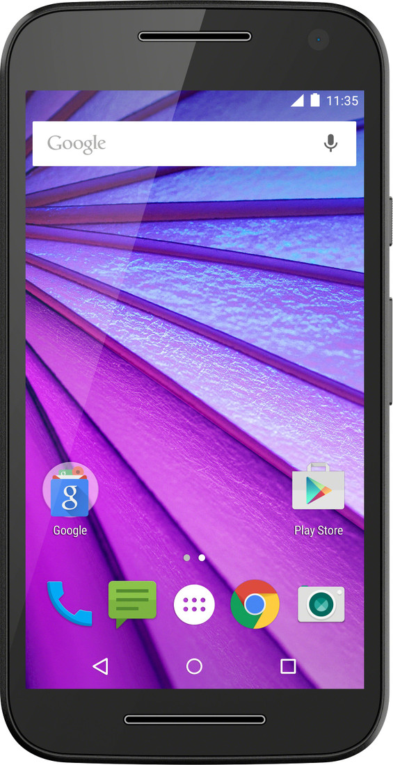
Now we didn't have such complains with the Moto G design since the first Moto G was released.We're still looking at the same curves, and the same chrome accents that actually look like dual front-facing speakers. So the new Moto G does not have notification led as the previous gen's had , but in fact the screen is the replacement for this. Moto G is not an AMOLED screen but has active screen feature just like the live screen in flagship's.

The Moto G 3rd Gen is a 142.1 X 72.4 mm phone dimensions which the phone is weighing around 155 grams. The phone with the plastic body is still rigid and maintains the same quality as the previous generations. The new Moto G has a a crome painted plastic side lines to enhance the look , but merely impressive.
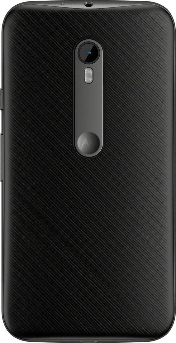
This time, though, Motorola took that textured finish and applied it to the entirety of the G's removable backplate. The sides are still as sparse as ever -- there's a textured power button and a volume rocker on the right edge -- so the phone isn't actually much easier to grasp than earlier models. The design in all is much inspired from Moto X and the Nexus 6 and has same guidlines like the authentic Motorola. the back has the same 'dimple' like the Moto X.Regardless of the design and body , the new Moto G's body is waterproof for up to 30 minutes as long as it's in less than a meter of water,which is a rarity for a phone at this price point.
Camera :
The new Moto G has basically plucked the same 13-megapixel sensor from Nexus 6, kept the f/2.0 aperture lens and added some additional IR-filtering coatings. The result is a camera experience that's leagues ahead of last year's model. Colors are bright and natural-looking, especially with ample light, and my test shots are crisp and detailed.
The actual process of shooting a photo is as straightforward as it's always been, which basically means there's zero delay between launching the camera app and snapping away. In case you haven't experienced Moto's approach before, there's barely anything on screen when you're taking a photo: One touch on the display captures an image, and holding your finger down takes a series of them. This dead-simple system works nicely until you actually decide you need some control over things, at which point a quick swipe left from the screen's edge brings up your options. Just don't expect a full manual mode. The best you can do is fire up HDR, or toggle the super-useful exposure and focus controls. In simple words the camera quality pretty okay once you know the price point of the phone.

Flipping the camera into video mode reveals that the 1080p video quality is fairly mediocre; there's not a lot of detail to be seen and colors appear bland even in generous lighting. The 5-megapixel camera up front doesn't aspire to much, and churns out adequate, if unexciting, shots. The front makes the picture not so good , but can fit a good amount of people in it.
Performance :
This year Moto G uses one of Qualcomm's quad-core Snapdragon 410 chips, with the CPU cores clocked at 1.4GHz and an Adreno 306 GPU. That doesn't seem like a huge lift in horsepower compared to the 2014 edition (quick refresher: a 1.2GHz Snapdragon 400 and an Adreno 305 GPU).
The new Moto G comes in two variants -- the 8GB ROM with 1 GB RAM and 16 GB ROM with 2 GB RAM.
We tested the 2GB version and the performance was smooth , the new Moto G handeled all the videos and audio's well. The multitasking was a charm and the Moto G is quite fast in this section with the pure Android experience. No lag was seen when playing FIFA 15 and all high end games. The device showed true performance and when comparing with the previous generation the Moto G 3rd Generation took a better and a nice leap.
Battery :
Now, how about that battery? It's a little sad that it took Motorola this long to increase the capacity of the G's battery, but whatever: This year we've got a comparatively spacious 2,470mAh battery to work with. The new Moto G comes around at 10 hours of battery juice , which is on par with most of the flagship 's like the Moto X or even the HTC One M9.

That's a big, big increase over the second-gen Moto G too; that device only managed seven hours and 38 minutes. If your daily workload is lighter than mine, you'll find the G is capable of lasting even longer -- I'd often get a day and a half of use if I saved most of my communication for my computer instead. This is the biggest improvement and also the biggest feature of the new Moto G which makes it a much more buyable phone.
Display & Sound :
When it comes to crafting a low-cost phone, you have to cut corners somewhere. For Motorola, that "somewhere" often winds up being the screen -- that's why after nearly two years we're still looking at a 720p display on a brand-new smartphone.It sports a 5-inch, 720p screen (the same size and resolution as last year), with a sheet of Gorilla Glass 3 providing some extra protection .Still, colors are bright and nicely saturated without appearing lurid, and they seem a touch more accurate than on last year's model.This display is one of the brighter ones I've seen on a budget smartphone, and it easily outshines the 2014 Moto G
The G's viewing angles are none too shabby either, even if the backlight gives things a milky cast when you hold the phone just right. Coincidentally, my biggest problem had to do with turning the screen to view it at an angle; the plain white of the app launcher or a web page can look gritty when viewed.
On the front it has a single bar type speaker which is similar to the previous generations.t struggled to give deep, bassy tunes their needed oomph, but mids and highs came through with vigor, although the resulting sound to be average. The speaker is just an okay - okay and again considering the cost it seems damn good.
Wrap Up :
Last year, the then-new Moto G was "still the best budget smartphone" around. the next Moto G is leading the same path. This time this new Moto G faces more heavier competition from other phone manufactures, but keeping that it may not be worn out soon . The new Moto G is going to stay as a budget winner till date. The new Moto G has all the features you would want in a $ 189 phone.Motorola had to make plenty of compromises to be able to sell this thing as cheaply as it is. Motorola's real gift is in making the G feel more powerful, more elegant than it really is, and that's worth the asking price.
Awesome blog. I enjoyed reading your articles. This is truly a great read for me. I have bookmarked it and I am looking forward to reading new articles. Keep up the good work!moto g manual
ReplyDelete