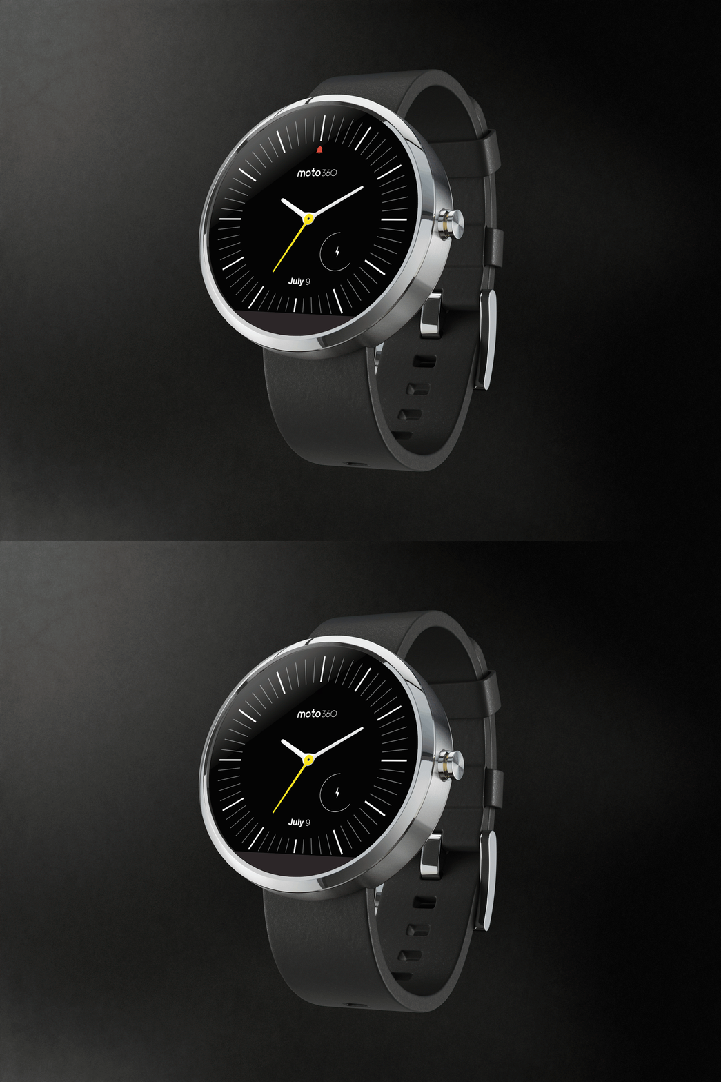
Moto 360 2 : Review
The Moto 360 smartwatch was the best smartwatch released during the Android Wear initial smartwatch offerings. Even now the Moto 360 still has a dominance in Android Wear Smartwatches line-up and with it's latest version it seems to have gain the top spot again. However speaking of smart -watches there has been quite a lot of competition from the early days , from tech giants to emerging companies everyone has a shot on the smartwatch.
Moto 360 actually introduced the round dial of smart -watches which got popular with the new smart-watches design.As of Motorola's Moto 360 2015 version is considered a lot is not changed in context to other smart-watches updated version's.telling that let's find out detailed look and feel of the Moto 360 2 ?
DESIGN :
As far as the design goes Motorola has kept the same design like the original Moto 360 watch and is happy to make more editions to it. The second generation Moto 360, introducing the customization capabilities available with Moto Maker for their latest smartwatch.ranted, the level of customization on offer isn’t as robust as what is available with their flagship smartphones, but you do get to choose between different sizes, the design on the bezel, the color of the metallic case, and various watchstraps.
With the help of easily removable watchstraps the new Moto 360 has more customizations offering to it. However , the annoying black semicircle is still present which is the one thing we did not want in the second edition.If I keep a blacked theme on watch dial, the semicircle blends in , but that said every individual has a personal styling. The crown-like button has now moved to the 2 o’ clock position, and has a very solid click to it.The new Moto 360 comes in two sizes ; one the 46 mm version and the other 42 mm , so if your wrist is small or big , the two sizes will help you achieve the size.
Display
Motorola was the first to bring the round watch face form factor to the
Android Wear game, but the company did receive a lot of flak for the
inclusion of the infamous “flat tire,” a small portion on the bottom
that houses the ambient light sensor.As far as the display itself is concerned, the IPS LCD screen features a
360 x 330 resolution, and is protected by a Corning Gorilla Glass 3
panel. The 46 mm iteration comes with a 1.56-inch display, while the
smaller version features a 1.37-inch screen.
The display performs as well as it should. Daylight viewing is pretty
good at the highest brightness settings, and the ambient light sensor
means that the user will not have to micromanage the screen.Even with ambient sensor on, the battery keeps on going for a whole day long and if it's switched off you can have the watch last at most 2 days.
Performance
Under the hood is a Qualcomm Snapdragon 400 processor and 512 MB of RAM,
and given the fact that this is processing package for
Android Wear, the new Moto 360 won’t let you down as far as performance
is concerned. As such, swiping among all of the different notifications
and cards were smooth and snappy, and extra input methods are available
via companion applications and voice input.
For fitness tracking, Google Fit and Moto Body do try and provide some
insight on your step count and lost calories, but these numbers tend to
be pretty arbitrary.So if you happen to have some type of fitness love this smartwatch will disappoint you.
In hardware, we start with the typical heart rate monitor that is
available with almost every Android Wear smartwatch out there. In this
case, it works well enough for the user that is curious about their
current heart rate, and it can be used during workouts to get a little
more fitness insight.The Moto 360 (2nd Gen) does come with IP67 certification for resistance
against dust and water, but if you decide to go with a leather strap,
having one makes this a watch that you will probably be removing before
getting into any water-based situations anyway.
Battery
Motorola brings back their wireless charging dock, that makes
the watch a kind of landscape bedside clock while charging, and remains
one of the better smartwatch charging implementations out there. The
battery gets a small bump to 400 mAh, and the battery life available
with the Moto 360 (2nd Gen) is pretty standard. About a full day of use
is possible, but it generally won’t go much beyond that. With charging
times of around an hour and a half to get to 100 percent
Software
Finally, on the software side of things is Android Wear, which hasn’t
changed a whole lot since the original Moto 360. Aside from being a
notification machine, with the cards and Google Now suggestions,
functionality stays pretty standard across the board.That said now there's an iOS app for the Android Wear , so yeah it's now compatible with your iPhone also.
Final Thoughts
The 2nd-gen Moto 360 is available now, starting at $299 for this 42 mm model and starting at $349 for the (huge) 46 mm one. Overall, the latest smartwatch offering from Motorola is a worthy update
to the original, that benefits from the company’s customization system.
Its big size may be a concern for some, but a slightly smaller iteration
is available for those who want it, and all said and done, this kind of
size has become pretty commonplace with smartwatches. Android Wear
continues to be as standard as ever, and even with Motorola trying to
add some extras, the shell of the device itself feels more important
than what it is ultimately presenting. Thankfully, you get more control
over that than with most other devices out there, and we think that is
the main selling point of the Moto 360 (2nd Gen).

No comments:
Post a Comment